Sector Rotation Chart Explained for Indian Markets
Learn what a sector rotation chart is, how to read it, and how Indian traders use it to track NIFTY sectors and time the market cycle.
You can open a market app, see banks green, IT flat, and FMCG slipping, and still not know where the money is moving. A sector rotation chart turns that confusion into one screen by showing which sector groups are gaining or losing strength relative to the broader market, so you can read leadership changes instead of just price changes.
Table of Contents
- What a Sector Rotation Chart Actually Shows
- The Basic Idea Behind Rotation in Plain English
- Reading the Four-Quadrant Rotation Chart
- Building a Sector Rotation Chart for NIFTY Sectors
- When the Chart Can Mislead You
- How Indian Macro Conditions Change the Chart
- A Worked Example Reading the Chart Over a Quarter
- Common Mistakes and a Practical Reading Checklist
What a Sector Rotation Chart Actually Shows
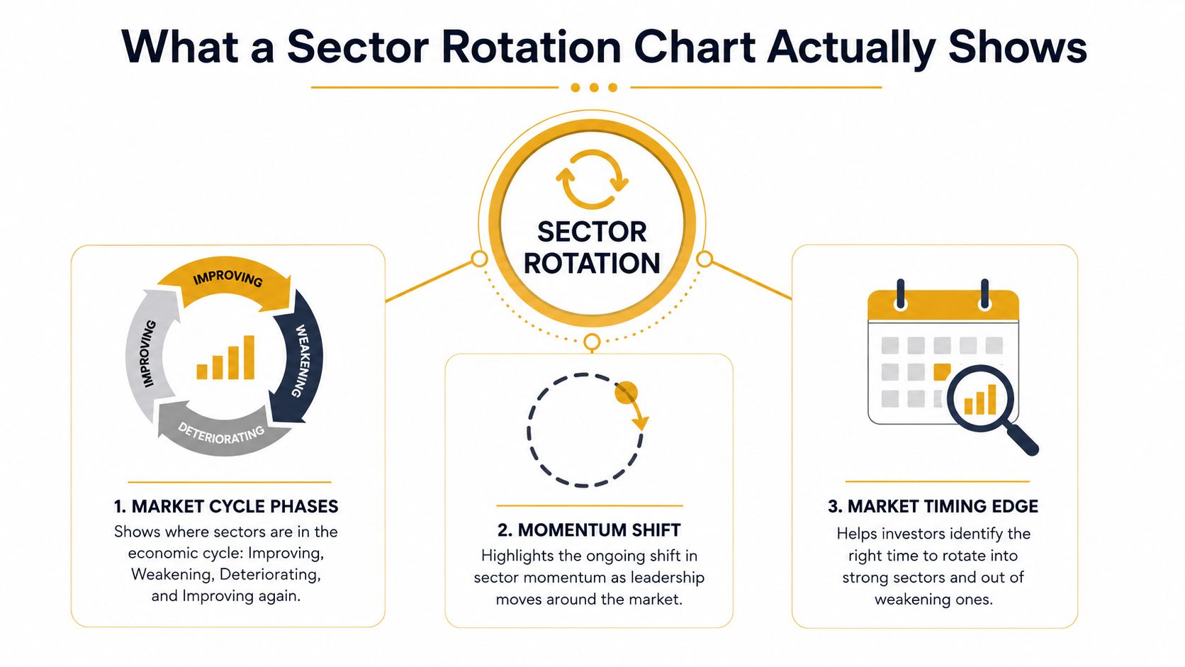
A sector rotation chart is a visual tool that compares each sector against a benchmark over time, so you can see which groups are drawing capital and which are losing it. It answers a live market question, not a forecast question, where capital is rotating right now, relative to the index.
For a first-time retail investor, that matters because the market rarely moves in one straight line. On one day, financials may lead while IT stalls, and on another day, defensives may hold up while cyclicals weaken. A sector rotation chart pulls those shifts into one screen, so you do not have to open ten stock charts just to understand what is happening beneath the index. If you are still getting used to basic market language, a simple share market basics guide for Indian investors can make the benchmark side of the chart easier to follow.
The idea is not new. Fidelity's long-run study of business-cycle rotation from 1963 to 2010 found that sectors such as consumer discretionary and financials beat the broader market by roughly 13 percentage points and 7 percentage points on average, and did so 86% of the time (Fidelity's tactical handbook of sector rotations). That history is why modern charts focus on relative strength, not just raw price.
The chart functions more like a traffic signal for sector leadership than a price ticker. A sector can rise in absolute terms and still lose ground versus the benchmark, which is why the chart helps with watchlist building, not just market watching.
Practical rule: A good sector rotation read starts with the benchmark, not with the loudest chart on your screen.
The Basic Idea Behind Rotation in Plain English
Think about a shopkeeper during festive season. If two product categories both sell well, the key question isn't “which one sold?” It's “which one sold faster than everything else on the shelf?” That's the heart of rotation. It's a comparison game.
The same logic applies in the market. A sector doesn't need to be the strongest in absolute price terms to be interesting. It only needs to be strengthening faster than the benchmark. Likewise, a sector can still be falling and yet be described as improving if it is falling more slowly than the market around it.
Relative strength and relative momentum
Two ideas sit underneath every rotation framework. Relative strength tells you whether a sector is outperforming or underperforming the benchmark. Relative momentum tells you whether that outperformance is speeding up or slowing down. When both improve together, the sector is usually moving into a more constructive phase.
That's why a rising sector can still be in a weak spot if the benchmark is rising faster. It's also why a weak-looking sector can sometimes be early in a turnaround if its decline is losing force. The chart is trying to show change in leadership, not just direction.
A sector rotation chart doesn't ask, “Is this sector up?” It asks, “Is this sector up faster than the market?”
For Indian readers, the easiest mental model is the way traders follow festive demand versus off-season demand or monsoon crops versus winter crops. The absolute number matters less than the change in share. That's the same lens you need for NIFTY Bank, NIFTY IT, NIFTY Auto, and the rest.
If you're still building the basics, Bharatstox has a plain-language primer on the wider market structure that can help: share market basics in India.
Reading the Four-Quadrant Rotation Chart
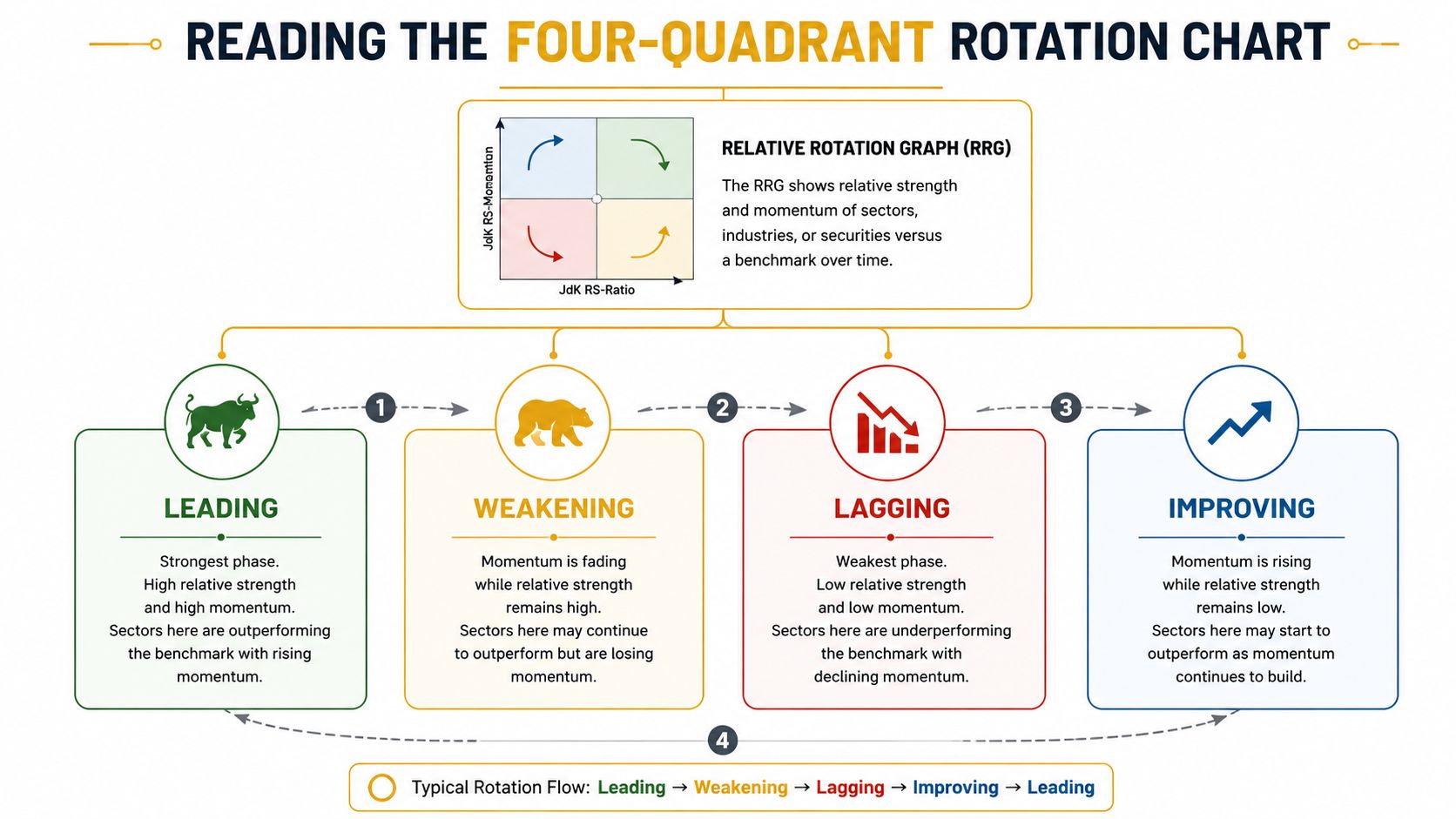
A Relative Rotation Graph, or RRG, puts sectors into four quadrants using two measures, relative strength on one axis and relative momentum on the other. Stockmojo's India-focused implementation maps all 18 NSE sectoral indices against Nifty 50 and uses a fading tail to show the path each sector has taken over recent sessions (Stockmojo sector rotation RRG). That tail matters because one day's position is less useful than the direction of travel.
The four quadrants in plain English
- Leading, top-right, means a sector is strong versus the benchmark and still gaining pace.
- Improving, top-left, means it's still not a clear leader, but momentum is turning up.
- Weakening, bottom-right, means the sector still has relative strength, but the pace is fading.
- Lagging, bottom-left, means the sector is weak and still losing ground.
Many beginners get tripped up. They see a sector in the Leading quadrant and assume that must be the best place to enter. Often, the more interesting area is the Improving quadrant, because the sector is turning up before everyone else has already crowded in.
How to map familiar Indian sectors
On a NIFTY-style rotation chart, you might expect NIFTY Bank or NIFTY Auto to move through Improving when rates and credit conditions get friendlier, while NIFTY IT can drift from Leading into Weakening when global spending softens. NIFTY FMCG, NIFTY Pharma, and NIFTY PSU Bank often help you spot whether the market is leaning risk-on or risk-off. NIFTY Metal, NIFTY Energy, and NIFTY Realty can add another layer when the cycle is changing.
The value of the chart is compression. Instead of scanning individual stocks, you're reading the market's structure at sector level on one mobile screen. That makes it practical for readers who want a quick sense of whether leadership is broadening, narrowing, or turning over.
Useful habit: Track the tail direction, not just the quadrant label. The path often matters more than the snapshot.
Building a Sector Rotation Chart for NIFTY Sectors
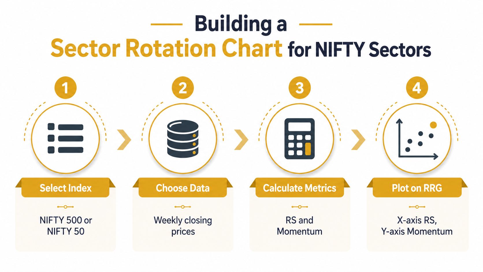
The cleanest India setup starts with a simple universe, all 18 NSE sectoral indices, compared against a broad benchmark such as NIFTY 50 or NIFTY 500. That benchmark choice matters because the chart is always relative. If the reference point is wrong, the signal becomes noisy fast.
What to feed into the chart
Use daily close data for consistency, then calculate two things, relative strength and relative momentum. TrendSpider's India-oriented explanation is useful here because it stresses that rotation is about relative performance, not raw price, and that a sector moving right and up is strengthening against the benchmark (TrendSpider on sector rotation tracking). This is like comparing runners in the same race, not comparing their practice times.
A beginner-friendly starting point is to pair one longer lookback for trend with one shorter lookback for momentum. The exact settings vary by platform, but the logic is the same, one window should capture the broader drift, the other should catch the recent turn. That combination helps reduce the false signals you get from one-day reversals.
A practical build order
- Select the benchmark. Use NIFTY 50 for a tighter market view, or NIFTY 500 if you want a broader base.
- Choose the sector universe. Keep the NSE sectoral indices together so the comparison stays consistent.
- Calculate relative strength and momentum. Use the benchmark as the denominator in spirit, even if the tool does the maths for you.
- Plot the sectors on the quadrant chart. Then watch how the tails move over several closes.
If you already use live market panels, Bharatstox's index dashboard can help you keep the broader market in view while you read the rotation map: Nifty 50 live analysis.
When the Chart Can Mislead You
A sector can look like it's leading even when only a few large stocks are doing the heavy lifting. That matters in India because the Nifty 50 is concentrated, with the top 10 companies accounting for about 38% of the index weight in March 2024, up from about 34% in March 2023, according to NSE index methodology disclosures and public materials (StockCharts article discussing NSE concentration). In that setting, the chart may be showing strength in a sector while breadth inside the sector is still thin.
What to check before you trust the signal
A rotation read should be paired with constituent breadth and weight contribution. If a sector is strong because one or two heavyweights are lifting it, the move can fade faster than a broad-based rotation. That's why it helps to ask, how many stocks are participating and how much of the move is coming from the largest names?
You also need to watch for stale data and overly neat backtests. Rotation changes quickly, and any chart built on outdated closes can lag the live market mood. Historical tests can be useful, but they don't tell you whether today's move is broad, temporary, or just the result of a narrow leadership pocket.
This is also where corporate action awareness matters. Earnings, guidance changes, and announcements can change a sector's shape before the broader chart catches up. Bharatstox's announcements feed can help with that context: NSE corporate announcements.
Bottom line: A sector rotation chart is a starting point, not a verdict. Always check whether the move is broad enough to be trusted.
How Indian Macro Conditions Change the Chart
India's sector chart doesn't sit in a vacuum. It reacts to rate cuts, inflation trends, retail inflows, and foreign positioning, so the same quadrant can mean something different in different macro settings. That's especially true when policy is changing faster than the usual textbook cycle.
Why rate-sensitive sectors deserve extra attention
The verified data in the brief says RBI cut the repo rate by 50 bps to 5.50% in June 2026, and CPI inflation eased to 2.1% in June 2026, the lowest since 2017. That backdrop naturally changes how traders read banks, autos, real estate, and consumer durables. When borrowing costs soften and inflation cools, these groups can start looking more responsive than they did in a tightening phase.
Retail flows can change the pace
India's market structure has also deepened. Demat accounts crossed 180 million by mid-2025, and monthly SIP inflows stayed above ₹20,000 crore for much of 2025. That matters because a broader retail bid can make leadership more persistent, or make rotations happen faster when crowd participation builds quickly. In other words, the chart may turn more frequently than it did in older, thinner markets.
| Macro Variable | Latest Reading | Direction | Sectors Most Sensitive |
|---|---|---|---|
| RBI repo rate | 5.50% in June 2026 | Lower after a cut | Banks, autos, real estate, consumer durables |
| CPI inflation | 2.1% in June 2026 | Cooling | FMCG, consumer durables, rate-sensitive sectors |
| Demat accounts | 180 million+ by mid-2025 | Expanding | Broad market participation, retail-heavy sectors |
| Monthly SIP inflows | Above ₹20,000 crore for much of 2025 | Strong and persistent | Momentum-led and domestic-flow-sensitive sectors |
The point isn't that macro tells you exactly which sector will lead next. It's that the macro frame tells you how much weight to give the chart. A clean rotation signal in a volatile policy environment deserves more caution than the same signal in a stable one.
A Worked Example Reading the Chart Over a Quarter
At the start of a quarter, NIFTY Bank sits in Lagging while NIFTY IT is in Leading. A few weeks later, the bank tail moves into Improving as rates ease and lending sentiment improves, while IT starts drifting into Weakening as spending visibility softens. By the end of the quarter, the bank tail has moved into Leading, and IT has slipped further, which tells you the market has rotated rather than risen.
That same quarter, NIFTY Auto can move from Lagging into Improving if financing conditions become friendlier and buyers start returning. NIFTY FMCG may still rise in absolute terms but remain stuck in Lagging, which tells you defensives aren't attracting fresh leadership. The useful clue is not just where a sector sits, but whether it is leaving one quadrant and entering another.
What the transition is really telling you
The transition from Improving to Leading is often more interesting than already-deep leadership. It suggests the turn is underway, but the crowd hasn't completely piled in. That's the phase where a trader's attention is usually better spent than on chasing a sector that already looks fully extended in the top-right corner.
The benchmark matters again. If the whole market is rising, a sector can look healthy even if it's only keeping up. Rotation means relative improvement, not just a green candle. The chart forces you to ask whether the sector is taking over leadership or moving with the tide.
For a live market cross-check, Bharatstox's broad index coverage is useful when you're trying to compare sector moves with the main market tone: NSE BSE live market.
Common Mistakes and a Practical Reading Checklist
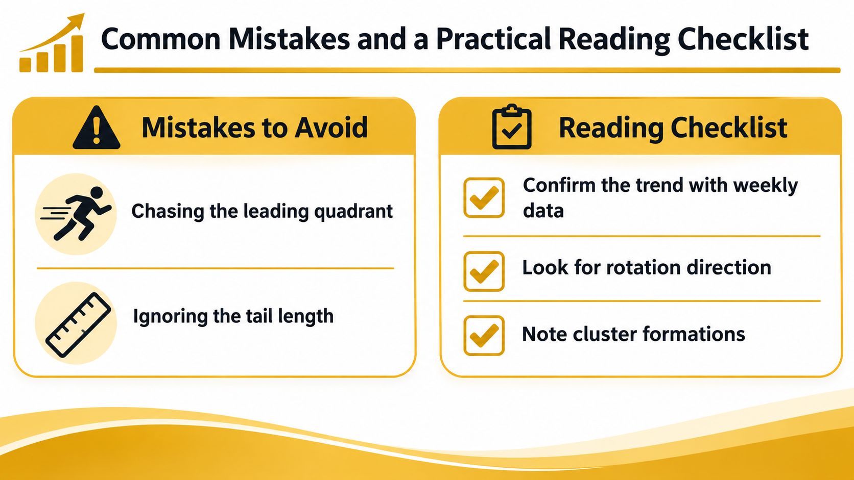
The most common mistake is treating Leading as a buy signal and forgetting that leadership can get crowded. Another is ignoring the benchmark, which turns a relative chart into a vague price chart. Traders also miss breadth, overtrade every tail twitch, or read stale data as if it were live.
Quick checklist before you act
- Confirm the benchmark. Make sure the sector is being compared against the right index.
- Check the lookback. Use the same window consistently so the signal isn't changing every time you refresh.
- Look for breadth. Ask whether the move is broad within the sector or led by a few names.
- Read the tail direction. A sector moving from Lagging into Improving needs more attention than one already deep in Leading.
- Cross-check macro context. Rates, inflation, and flows can change how reliable the signal feels.
This is for informational and educational purposes only and not investment advice. Consult a SEBI-registered adviser before investing.
A rotation chart works best when you treat it as a market-structure tool. It helps you notice where leadership is forming, where it is fading, and where to focus your watchlist next, but it doesn't replace judgment or personalised advice. Use it for awareness first, action only after the rest of the picture makes sense.
Bharatstox covers Indian market news, live index action, and plain-English market education for retail investors who want to understand what's moving and why. If you want more explainers like this on sector rotation charts, live NSE and BSE context, and market structure that's easy to read on mobile, visit Bharatstox.
Disclaimer
This article is for informational and educational purposes only and does not constitute investment advice or a recommendation. Investing in securities markets is subject to market risks. Read all related documents carefully before investing.